We’re delighted to unveil the latest updates to the CSCCE website – including a brand new logo and look.
Welcome to the updated CSCCE website – with a new logo and look! We’ve also updated our Twitter account and added a LinkedIn page if you’d like to follow updates from the Center there too.
Read on for more info about what’s currently on the site – and what’s coming. And also for the story behind our beautiful flower head design. We hope you like the new look as much as we do!
What’s on the website – and what’s coming
The CSCCE website is intended to be a growing resource of useful information for scientific community managers, funders, and scientific organizations adopting community-driven approaches. The website covers several types of content:
- Engaging with our programming: Including our community engagement fellows program and the new community of practice for scientific community managers – with a Slack group, monthly community calls, and working groups.
- Our Blog: Is the largest freely available online resource about scientific community management. It’s where we share posts by CEFP Fellows and community members reflecting on the roles of scientific community managers, plus program updates and occasional staff posts about community theory.
- Resources: Right now, you can browse the results of our survey of scientific community managers, and our series of posts on diversity, equity and inclusion. In the coming weeks we’ll begin the next phase of sharing our resources for scientific community managers which will include outputs from the CEFP fellows’ project teams such as manuals, guidebooks and tip sheets.
- Information about the paid trainings we deliver and an overview of the research that we’re engaged in. With more to come on these pages.
Our content is going to expand and evolve over the next few weeks and months so watch for updates as we continue to share.
The story behind the logo
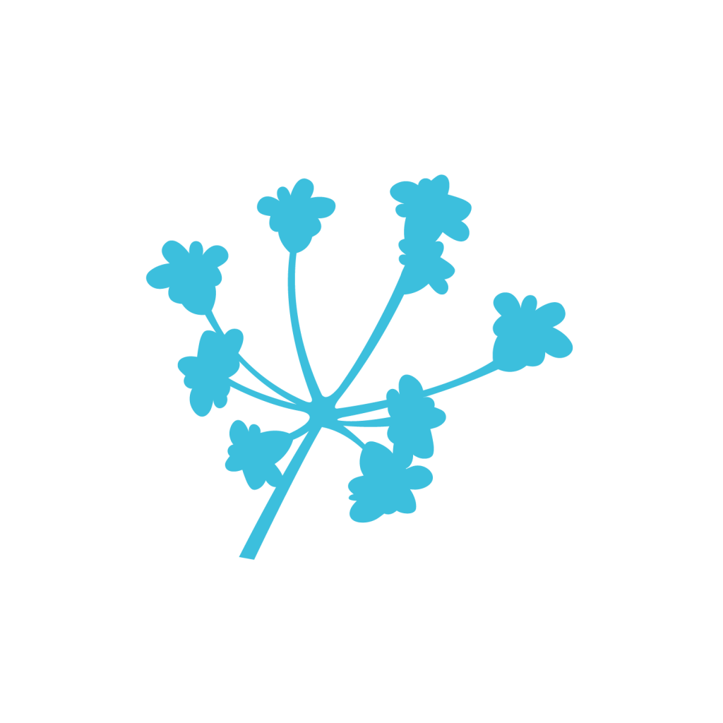
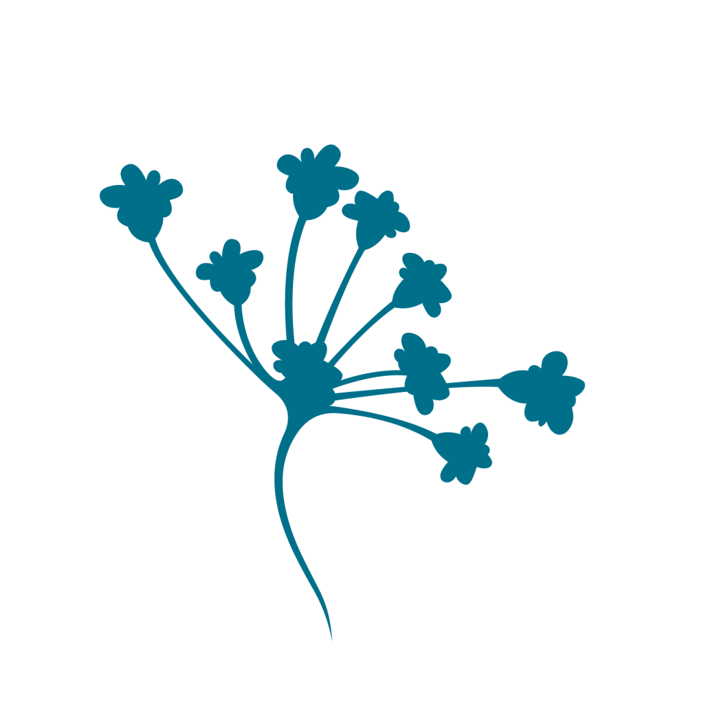
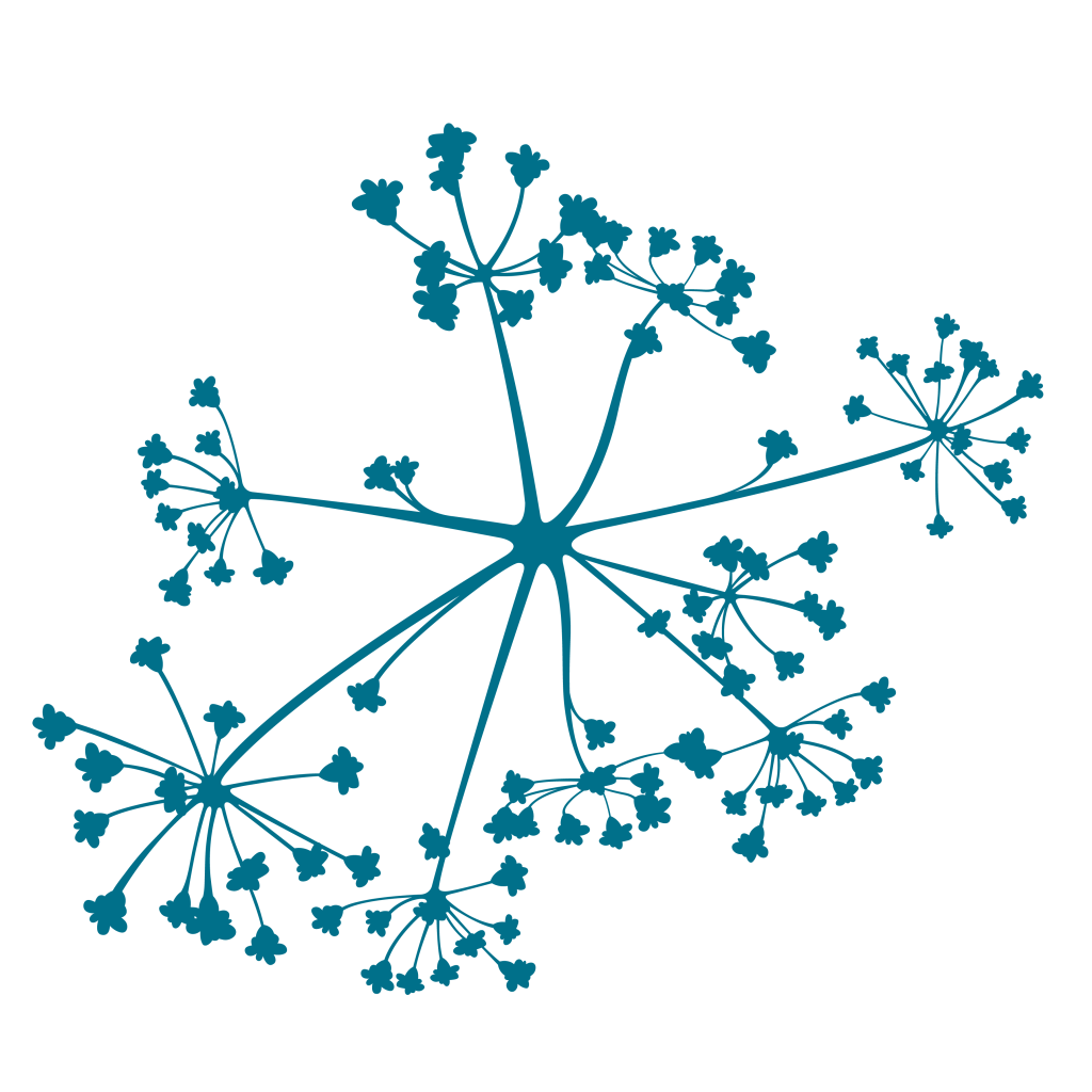
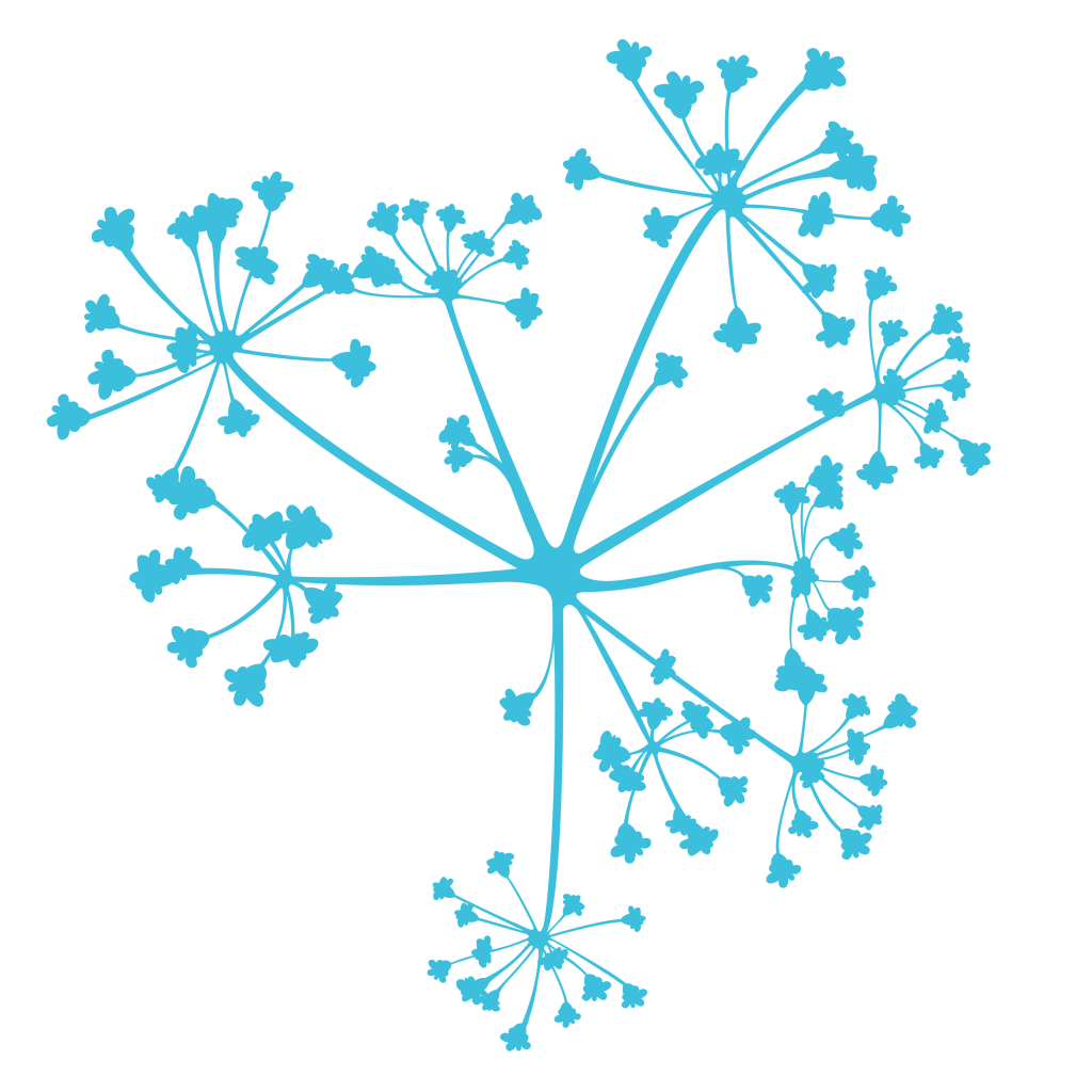
When we came up with ideas for the logo, we wanted something that alluded to communities and networks – but that was more vibrant and dynamic than traditional network diagrams. We also liked that metaphors from the natural world (supporting growth, tilling the soil, seeding ideas etc) are common in community-building and so we settled on an umbel flower head design- as seen in parsley, dill, onions and other plants.
For us, the flexible design – which you’ll see in different but related forms on our new stickers, on social media, and around the website – symbolizes several things:
- The dynamic, changing nature of communities – with multiple (and sometimes fractal) connections between community members, plus multiple points of interaction around a topic or theme.
- The importance of dispersing knowledge and ideas in our collective activities.
- The balance that’s at the heart of the community manager roles. Deep roots down into the soil and the cyclical re-seeding and iteration of ideas symbolize resilience. And also the less visible work we do to support the success of our communities – such as listening, supporting, and planning. While vibrant flower heads capture the visible outputs and the emergent potential that a community approach can unlock.
We hope you love the new look as much as we do. And let us know if there are other interpretations that you can see in the logo that reflect your own role as a scientific community manager.
Acknowledgements and thanks
Thank you to C&G Partners for their beautiful design work.
